Sector - Travel risk management & Staff duty of care
Timeframe - 2 months
Deliverables - A UX audit, the core of a new design system, user flows and high fidelity mockups
This piece of work followed the build of an ‘MVP’, in which speed was the ultimate priority. So as you can expect, the user experience was lacking to say the least. It resulted from the compounding effect of our engineers being forced to cut so many corners along the way because of particularly tight deadlines.
As the design lead, my role was to identify and articulate the issues, propose relative solutions, and lay the foundation for a new design system to help remedy the situation. This coincided with the introduction of a new brand, which I’d supported an external marketing agency in the development of. I would work to weave this new identity into the overall user experience.
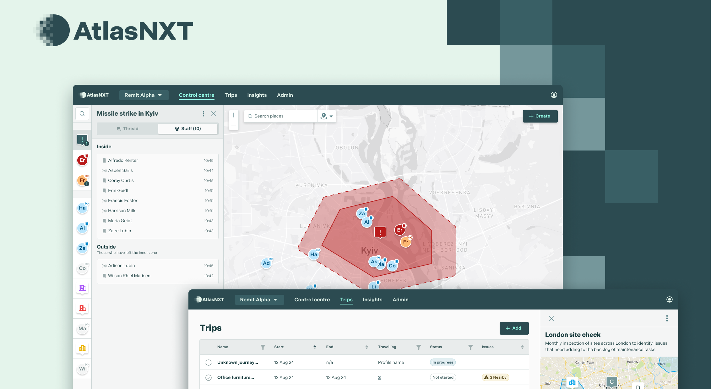
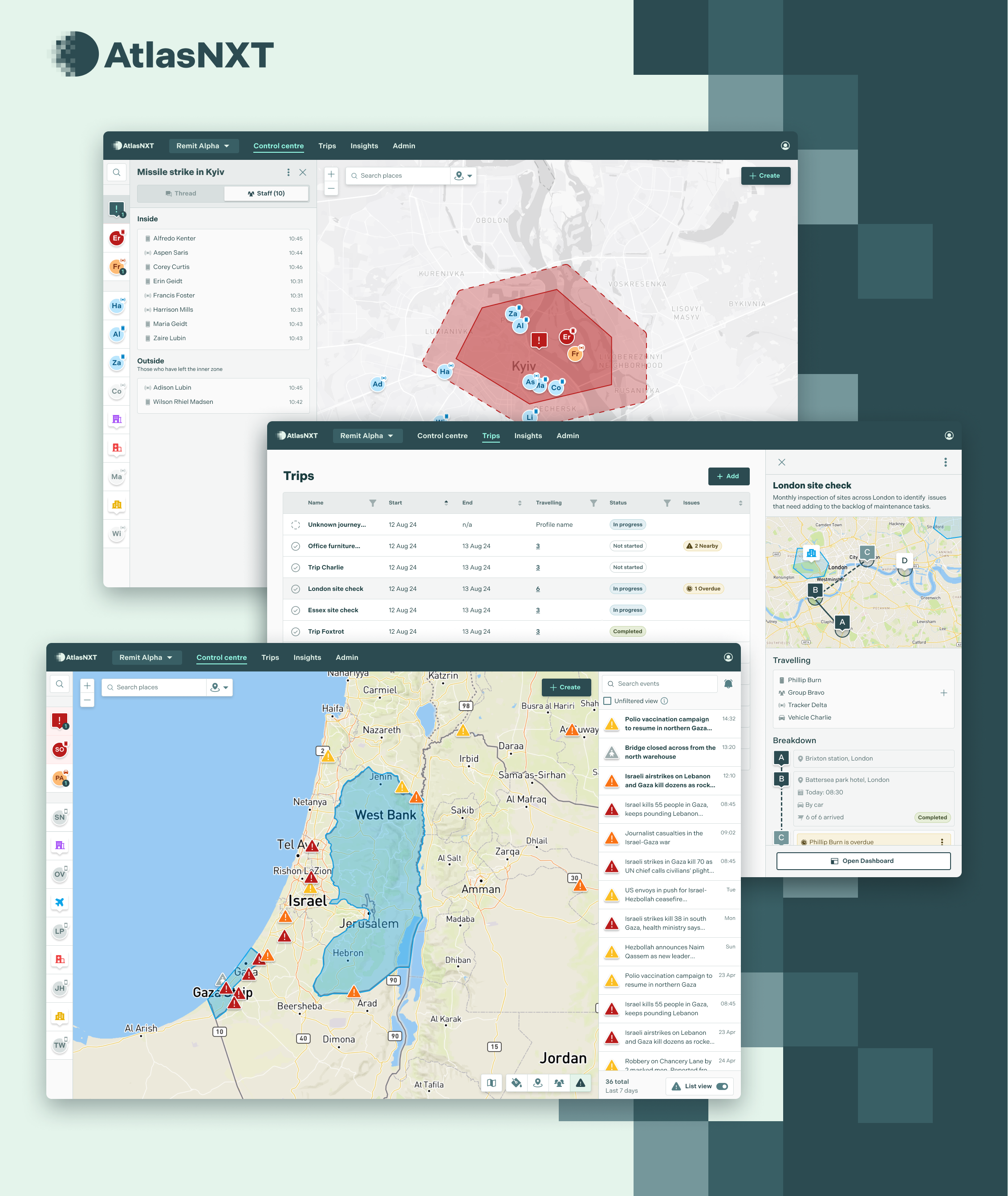
We developed a new product to replace outdated legacy platforms, with goals to retain revenue through customer migration whilst also expanding into the broader market of Travel Risk Management for large enterprises.
Working with an already complex product landscape, we temporarily followed a more waterfall approach to build something that preserved the proven, high-value features. Importantly though, in a way which abstracted the functions into building blocks. This way, we would set a foundation that could be combined in creative ways to help scale and apply in different use cases to test.

On a tight timeline and without a design system, we settled with a lower fidelity approach to begin with and utilised an off-the-shelf frontend framework (Daisy UI). The process was a little more ‘on the fly’ than I’d have hoped so it was important that we were highly collaborative and problem-solved to keep momentum. Despite our best efforts, most of the additions suffered some form of ‘descoping’ compared to the initial brief.
As ‘UX debt’ accumulated over time, the issues were becoming clearer. Many users were needing guidance through the interface, forcing them to recall (and usually forget) how certain features worked instead of relying on their intuition. We were also beginning to suffer from performance issues which ultimately convinced the business to allocate resources for us to rebuild and rebrand the interface.

I conducted a thorough audit of the web app through:
Several issues were clear to me already (basic usability principles) so I focused the user testing in areas that had more assumptions. It was important not to waste precious user minutes in places that wouldn’t give us new insights. The testing revealed apparent issues, such as inadequate hover states, labelling, and tooltips, which failed to meet basic usability requirements.
To ensure we wouldn’t stray from user-centricity, I framed the analysis in the voice of a user. The key was to highlight the problems rather than presumptively proposing solutions.

Like in any product team, time was a scarce commodity so it was important to prioritise the problem areas that we did have time to fix. Maximising the impact of this work by addressing the right things. I graded all of the findings in the form of the MoSCoW method:
The Won’t (for now!) bucket is where everything on the tail end of the priorities would fall, and park in our backlog.
These grades were based on:
Meanwhile, with the help of an external marketing agency we were developing a new brand for the product. I was involved in a series of feedback sessions throughout which we came to an agreement on the logo and styling, as well as marketing elements like messaging and tone of voice.


Armed with the output from the UX audit and a fresh brand, I had what I needed to build the foundational blocks of a design system. The audit gave an overview of the components we were using, any permutations, and where different components might be more suitable.

Colour and typography were my first avenues. The marketing-generated palette needed expanding for use with the product so that it would be appropriate and versatile enough to cover the range of use cases. As a map-based platform, I was particularly conscious of how colour should be applied to the UI. It would need to be quite monotone, and focus much on contrast to help the user’s focus and not detract from a busy and unpredictable map view.
After defining other core elements like an appropriate grid system and spacing, shadow levels and cornering, I was able to start creating the base level components. Those you might call the ‘atoms’ in an atomic system, such as your buttons, input fields, checkboxes, toggles etc.

In designing them I not only accounted for existing use cases but how it might scale and accommodate likely future variants. For instance, dropdowns to allow for multi-selection or supplementary information etc.


I started to incorporate these new elements into proposed flows and interactions - all the while organising them into reusable components and variants in Figma. Taking the time to do this was important for streamlining my workflow for quicker and more effective communication of design in future. For example, it would free me up to create interactive prototypes and bring designs to life so they could be more thoroughly scrutinised and tested before committing to building anything. Which I managed to use in comparative user testing with a number of the same stakeholders as I ran through with before.
I also used this project as an opportunity to give the app more character and introduce some illustrations. Empty states being the perfect use case. It also worked as a nice way to incorporate the ‘flash’ brand colour which was more difficult to apply practically elsewhere because of its intense saturation.

This is set to be released into the product gradually to users and those that are newly onboarding so the outcome of these changes will be summarised here in November (within a few weeks). The user testing indicated a significant improvement in task completion and time taken but of course it needs to be monitored when released into production.


